
Plotting is another output option provided by COPASI. Most often, you will want to visualize the concentrations of one or more species during a time course simulation. This is most easily accomplished by selecting a predefined plot template in the Output Assistant. However, the Output Assistant cannot accommodate every possible plot you might need, so there are times when you’ll want to define custom plots.
Currently, COPASI supports only two-dimensional plots. To create your own
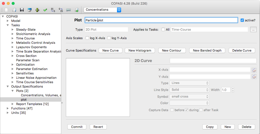
plot, go to the Output → Plots section in the object tree and open the plot
definition dialog. Each plot consists of one or more curve or histogram
objects. To add a new curve, click the New curve... button.
 |
| Empty Plot Widget |
When you add a new curve to your plot, a selection dialog opens, similar to the one described in the report creation section. The main difference is that there are now two tree views side by side instead of just one.
As with report definitions, you can choose between a simple tree view and a full tree view. For most plotting tasks, the simple tree provides everything you need.
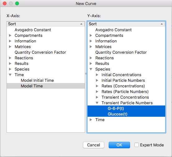 |
| Selection Dialog with some Items selected |
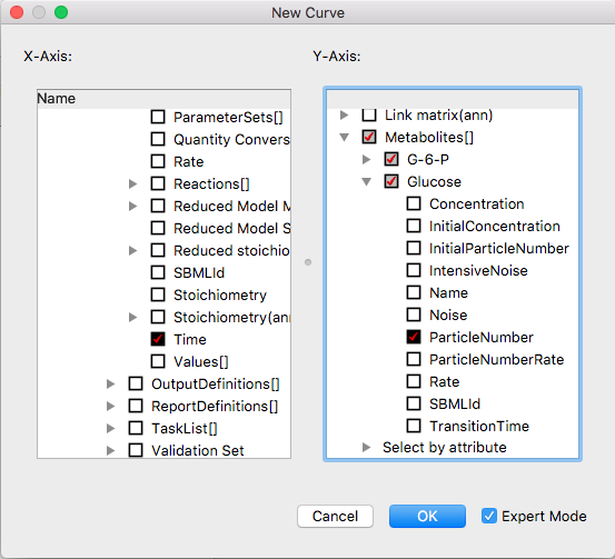 |
| Expert Selection Dialog for Curve Objects |
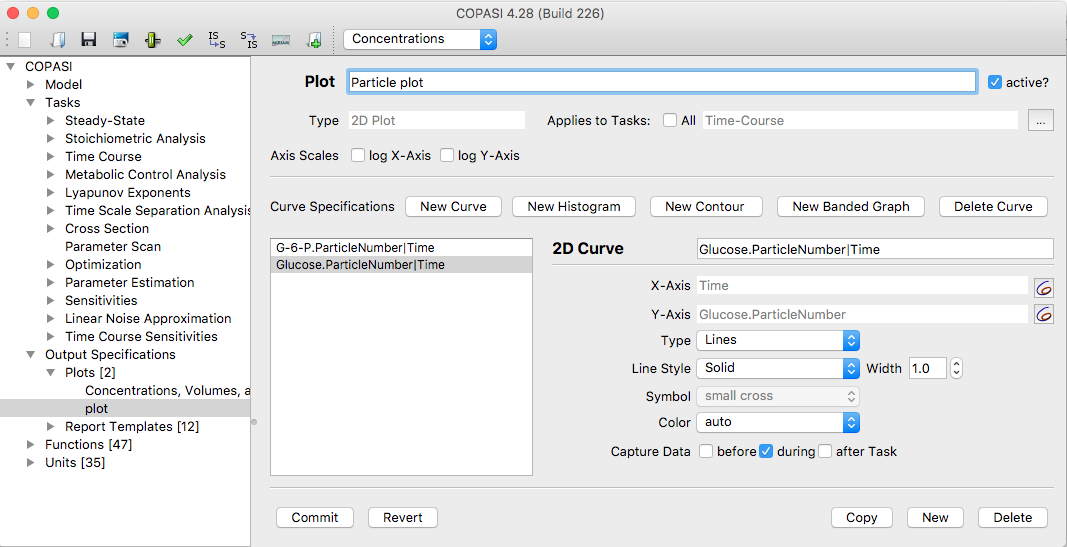
Once you have finished making your selections, click the OK button to return to the curve definition dialog. For each object you chose from the right-side tree, a corresponding tab will appear in the curve definition area, each tab represents a curve object for your plot.
To remove a curve, select its tab and click the Delete curve button. The next time you run a time course simulation, any plot marked as active will be plotted automatically. The process for marking a plot as active is described below. You can also choose which tasks can trigger a plot. By default, a plot will apply to all tasks, but you can disable this option and select specific tasks by adjusting the task selection checkbox.
Another way to set whether a plot is active is in the plot table, where all plots are listed. Each row includes an active column with a checkbox you can use to toggle the plot’s status. If you change the state of one or more plots, you must commit your changes either by clicking the Commit button or by performing another action that commits changes (see the compartments section for more details).
You can also specify if the plot should use a logarithmic scale for either or both axes.
Each curve object has a title and defines what is shown on the x- and y-axes. Additionally, you can specify, for each curve, whether it should be drawn as a line, as points, or as symbols.
 |
| Curve detail settings |
In the plot definition dialog, you can add or remove curve objects, assign a name to your plot, and specify if the plot should be active using the active checkbox. Only plots marked as active are displayed when you run a time course simulation.
Besides curves, COPASI can generate a histogram of the data from a time course simulation (see time course simulation) or a parameter scan (see parameter scan). A histogram is a bar graph that shows how frequently a parameter takes particular values.
To define a histogram instead of a curve, click the New histogram… button in the plot definition dialog. You can specify a title, the variable to display, and the increment value, the width of each histogram bar. For example, if your parameter ranges from 3 to 8 and you set the increment to 0.1, COPASI will draw a histogram with 50 bars, each representing a value range of 0.1 units. Curves and histograms may be combined in a single plot.
 |
| Histogram |
If you like to try it yourself:
You can also define contour plots by clicking the New Contour button. For a contour plot, you specify values along three axes. The z-axis values are represented with a color map. You can define specific values for which contour lines should appear.
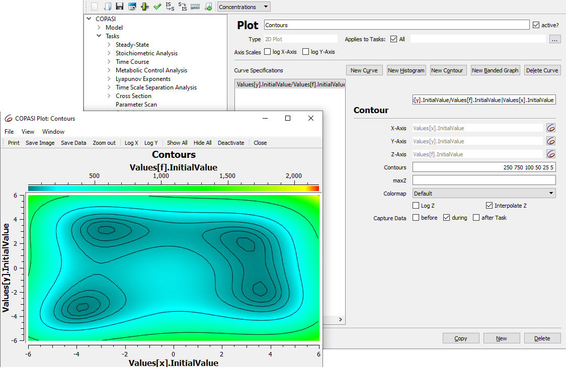 |
| Contour plot settings |
If you like to try it yourself:
To add a banded curve to your plot, click the New Banded Graph button in the plot definition dialog. For a banded curve, you specify one value for the x-axis and two values for the y-axis. COPASI will then display a band between the two y-values for each x position.
 |
| Banded curve |
If you like to try it yourself:
Parameter Scan allows you to repeat a subtask several times, each time making different adjustments to the model. For example, you can run multiple Time Courses with varying initial concentrations of a particular species. Creating plots for Parameter Scan results requires some special considerations. If you are not familiar with the Parameter Scan task, please refer to its section in this manual for an overview.
Here are a few simple guidelines to follow when plotting results from a Parameter Scan:
The Sub Task Output setting in Parameter Scan should match the plot’s Capture Data setting.
If you use multiple Sub Task Outputs in Parameter Scan, set the plot’s Capture Mode to “before” to separate the results from each individual run.
If no selection is made in Sub Task Output (Parameter Scan), the plot lets you choose from three Capture Modes: