
Here, we describe the profile likelihood method implemented in COPASI. This is something, you will want to do to ensure, that the parameters found in your parameter estimation task, are identifyable. The basic approach follows Schaber’s approach, where starting from a good fit, you create parameter scans around the best value found for a given parameter, while reoptimizing the remaining parameters. If the fit was the best one found, than going away from teh best value would increase the objective value on either direction. If we find a flat line, that means the parameter is not identifiable, if we find a curve that is flat on one side, we can only identify the corresponding bound.
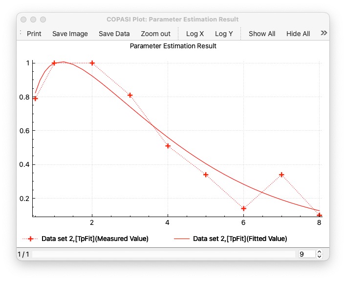
The first step, is to use a model, that already has a good fit. This documentation describes it on Schaber’s example, that you also find as COMBINE archive: schaber2.omex. When you run it and plot a parameter estimation result you would see a plot like this:
The tool implements the three steps of the approach of:
generating different copasi models for each of the scans. (these files could then be moved to a cluster environment for parallel computation)
running the the scans (if you dont run the files on the cluster)
plotting the result, by specifying the directory where the reports have been stashed.
Once you have a model with a good fit, select Profile Likelihood from the Tools menu. The following dialog comes up:
Generate is the first step, generating all COPASI files (2 files per parameter to be estimated.). Once the files are generated, you would then take them from the folder where and run them on your compute cluster using CopasiSE. Or you could use the Process section of the dialog on the next page. When generate is pressed this will also saves the settings used in the target directory as <prefix>settings.json. That can be loaded back in using the load button at the bottom left corner. It will also store <prefix>info.json with the information about the run needed to plot the results later.
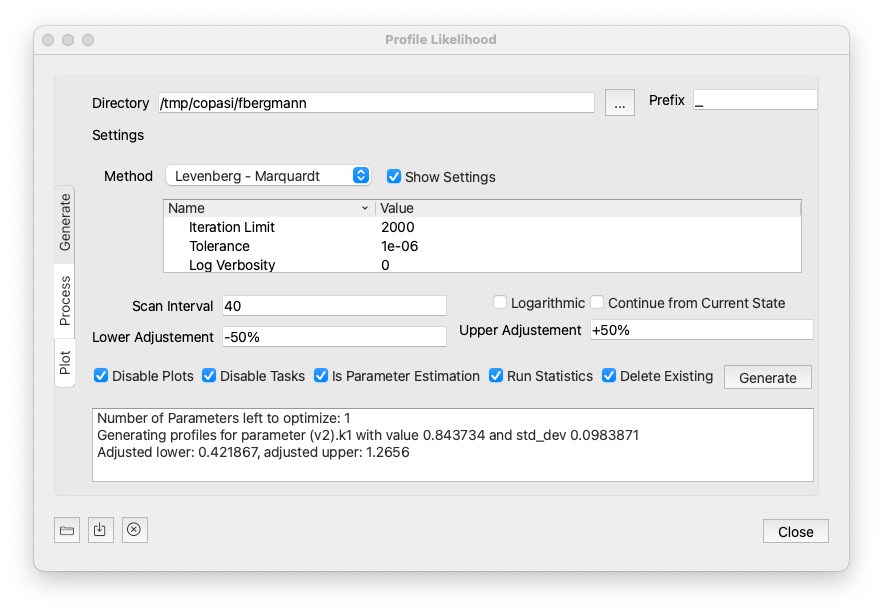
Settings:
Delete Existing is checked, files matching the prefix in the specified directory will be deletd prior to hitting Generate. It defaults to a temp folder, but you can specify any folder you want using the ... button next to it.40, then the first file will take 40 steps into the lower direction, and 40 steps into the upper direction.Continue from Current State: whether to continue from current state, from one parameter estimation to the next. It could save some steps on a local method.
Lower Adjustement / Upper Adjustment: How to modify the parameter value. Note that the lower value will have to be lower than the current value for the parameter. And the upper value higher than the current value. There is a number of way to specify how to modify the values:
explicit number: You could specify the value direction. So a value of 0.1 would set the corresponding bound to that value directly.+/- <value>%: Specify a percentage of the current parameter value. For example: -50% would half the parameter value.* <value>: multiply the current parameter value witht the specified value.+/-<value>SD: adds / substracts multiples of the standard deviation from the current parameter value. This is only working if standard deviations can be computed for the model.Run Statistics: whether to compute the statistics before the run.
Generate is clicked the files starting with the specified prefix will be deleted from the specific directory.If you dont want to run the generated files on your cluster environment, this section of the dialog will process all the files using CopasiSE. This will launch CopasiSE with each file, which just executes the task marked as scheduled. (So you could use it for all other files with scheduled tasks.)
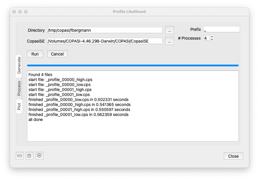
Settings:
... button next to it.CopasiSE, but sometimes it cannot be run directly from the Path, so you might have to locate it directly.A click on Run will then process all files matching the prefix, and maching profile_*.cps. You will get notifications in the text widget beneath.
To stop all currently running processes, hit the cancel button.
Once the files are processed it will print all done. But you do not need to wait for all the computations to succeed, you could go to the plot widget.
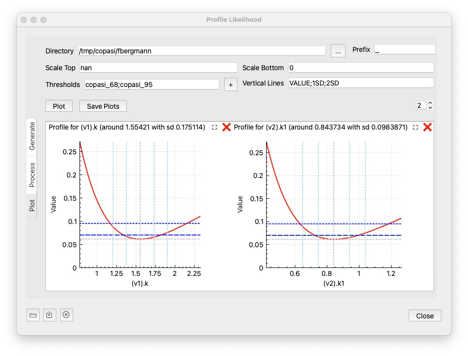
Once the results have been computed on the cluster environment, or computed using process from the last step. This option allows you to plot the results. Just specify the directory and click the Plot button.
Settings:
Scale Top: sets the maximum value of the y axis if specified. If set to nan, the max value obtained from the report files will be used.
Scale Bottom: the minimum value of the y axis to display. defaults to 0. If set to nan the min value obtained from the reports will be used.
Tresholds: semicolon separated list of horizontal lines to be plotted, so you get a visual clue if the parameters are below a value you favor. There are a number of options that you could choose:
value: if you specify a number, the horizontal line is plotted there.copasi_68: 68% confidence, 1 parametercopasi_95: 95% confidence, 1 parameterschaber_chi2_1p: Schaber chi^2 for 1 paramterschaber_chi2_p: Schaber chi^2 for m paramtersschaber_fratio_p: Schaber F for m paramtersdonaldson_fratio_1p: Donaldson F for 1 paramtervalue%: percent of the objective value reachedVertical Lines: semicolon separated list of vertical lines to be plotted. Possible values are:
VALUE: the original best parameter valuenumber: a value at which you want to see a vertical line<value>SD: a standard deviation at wich you want to see a line, for example 1SD would plot a line at +1 and -1 standard deviation around the valuevalue%: a percentage of the best parameter valueOptionally, you can save the created image using the Save Plots button. The number control at the right side specifies how many plots are displayed per row. As there might be quite a number of parameter plots, you can close or pop out individual ones:
- ❌: closes the individual plot (you can always re-create them hitting the plot button again)
- ⛶:  will open the plot in a separate dialog
For full control of what is being displayed on each plot, you can right click on it, enable the legend, and toggle on or off individual curves.